404 and responsive typography
Intro
Recently, I created a proper 404 page for this blog.
The default Vercel “this page doesn’t exist” gives off an amateur vibe of a high schooler who can’t figure out how to configure their website or someone who made, and then stopped hosting a project.
Here’s what default Vercel error page looks like:
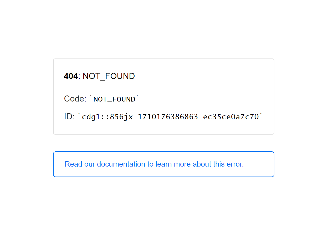
See? Laaaame.
I should have had my own 404 page from the get-go.
Anyways, while I was building it, I came across a slightly intriguing typography optimization problem. It’s a little hard to write about it, but it becomes more obvious when I show it.
A demo is available here.
Side note: JSBin has been my favorite prototyping site for probably a decade.
Traditional typography doesn’t really contend with text that lives inside an actively resizing container - but with the advent of the smartphone and the demand to view content on screens of all shapes and sizes, lines (literally) break, and typography needs to become a little more flexible.
I’m not going to claim that I’ve invented or discovered something crazy about type and the mobile web, but I’ve noticed that just like how 2 columns go to 1 as screens get thinner through css media queries, “dynamic” line breaks can be added and removed as screen sizes get smaller to ensure that “rags” on text stay consistent.
Rags??
See here.
Long story short, it’s the horizontal position of the ends of lines; People like it when they’re consistent.
A poor example:
A long line goes here
and short
and back to another long line there
and
if you keep doing this, it tends to look really weird.
It looks even worse on smaller screens!
(Try resizing the window.)
Why does this annoy the reader?
Our eyes (and brain) have to do more work to read a line because the starting and endings aren’t consistent anymore. As we scan through a paragraph, we expect words where there are none, and the rhythm of looking at the lines becomes interrupted - just like the shape that the block of text makes on the right side.
Of course, I’m forcing the line breaks here, this isn’t natural. However, unlike type on fixed, traditional mediums, line breaks are no longer under your control when you publish to the web! Browsers wrap text by default. Unless you want to look like this, and you’ve explicitly set white-space: to pre; or nowrap; in your css styling, the text will break if the viewport gets small enough.
Usually, this is fine. Wrapped text does a pretty good job at keeping rags reasonable, but only if you don’t add any <br>’s (that’s the HTML code for a line break) yourself.
Long story short
I came across a scenario where I wanted to add line breaks, but they only looked good on the desktop (a bigger screen). This was my mini dive on how to solve this.
I started writing this article on 12-22-2024 and finished 2-10-2025. Not sure which date applies best.